← Gallery
 Unlock all prompts
readymag.com
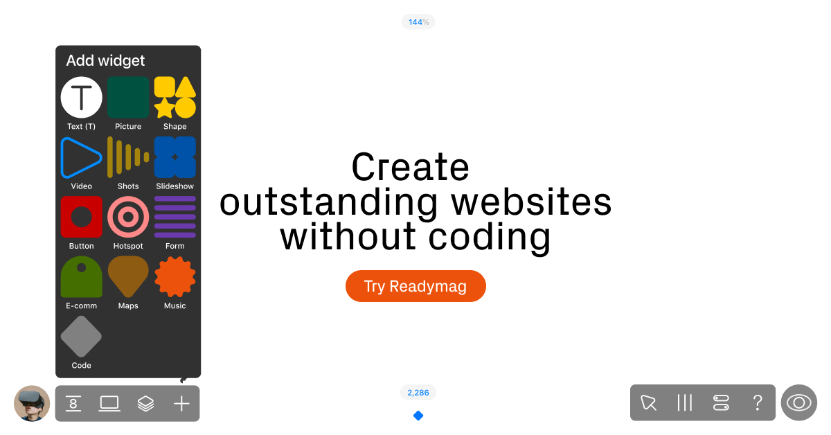
BSaaS · 73/100 · Almost proper. A few tweaks away.
Real UI elements and thoughtful details make the product pop. The CTA could use a similar spotlight
Design DNA
Type
Geometric Sans-Serif
PaletteSoft warm tones
Design DNA
Turn readymag.com’s design into your OG
- Full color system with hex codes and harmonies
- Typography breakdown with role mapping
- Layout, patterns, and recreation steps
- One mega-prompt that has everything
Platform fit
OKFacebook / LinkedIn / Discord(1200×630)
OKX / Twitter (Large Card)(1200×628)
INFOX / Twitter (Summary)(120×120)
OKWhatsApp / iMessage(~300×157)
OKSlack(~200×105)
OKChatGPT(~400px wide)
INFOGoogle Search(N/A)
Under the hood
og:title
Readymag
og:description
The design tool for outstanding websites
og:image
Dimensions
1200×628
Industry
SaaS
Color mode
light
Layout
Score breakdown
+
OG Image
Has og:image tag
https://c-p.rmcdn1.net/5f747d54a0bfc900b69a5fea/Image-dae06291-eaaa-4d69-babf-c997a2f27a8c.jpg
!
Dimensions
1200×628, 1.91:1 ratio. Works but 1200×630 is ideal
!
Title
Too short (8 chars). Underuses the card space
Readymag
!
Description
Too short (40 chars) for rich previews
The design tool for outstanding websites
+
og:type
og:type = website
!
File size
Could not determine file size
+
Quality Profile
AI analysis
Strengths
- +Clear and concise value proposition ('Create outstanding websites without coding').
- +Strong, contrasting call-to-action button ('Try Readymag') for immediate engagement.
- +Minimalist design focuses attention directly on the core message.
Improvements
- →Lack of prominent brand logo or name in the main visual area, only on the CTA button.
- →Could benefit from more visual interest or a subtle graphic element to break up the large white space.
- →Image dimensions (1200x628) are slightly off from the optimal 1200x630 for Open Graph.
↗
Takeaway
Employ a single, high-contrast call-to-action button placed directly below the main value proposition. The use of a vibrant brand color (orange) for the button against a monochrome background ensures maximum visibility and drives user action effectively.
Want your OG image this proper?
Check your current OG or generate a new one from your brand.
More like this
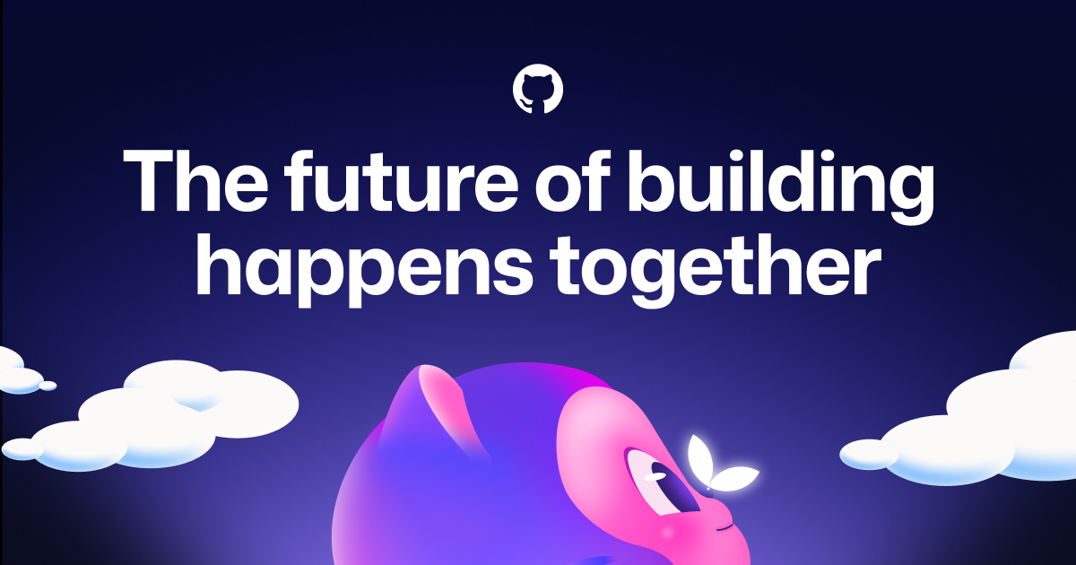
github.comA
GitHub · Change is constant. GitHub keeps you ahead.
View editorial →
Mascot's directional gaze isn't just charm, it's a compositional cue for the future
Mascot's directional gaze isn't just charm, it's a compositional cue for the future
interludeapp.netB
Interlude
View analysis →
authkit.comB
AuthKit by WorkOS
View analysis →

shopify.comB
Shopify Editions | Winter '26
View analysis →
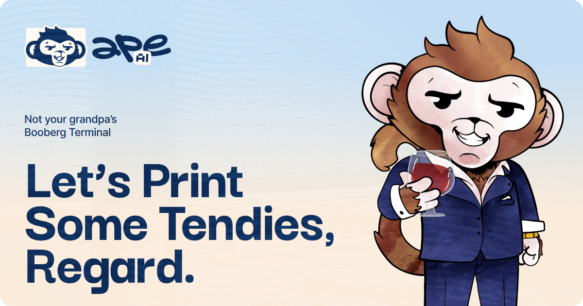
askape.comA
Ape AI - AI Stock Market Companion | ChatGPT for Stock Discovery & Trading
View editorial →
Character design that elevates a niche theme into unforgettable brand identity
Character design that elevates a niche theme into unforgettable brand identity
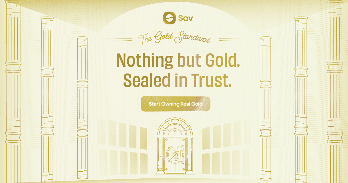
gold.sav.moneyA
Sav Gold | The Smartest Way to Own Gold in the UAE
View editorial →
Contrast pushes the limits, but the cool tones still cut through
Contrast pushes the limits, but the cool tones still cut through
