← Gallery
 Unlock all prompts
interludeapp.net
BSaaS · 81/100 · Almost proper. A few tweaks away. · Checked
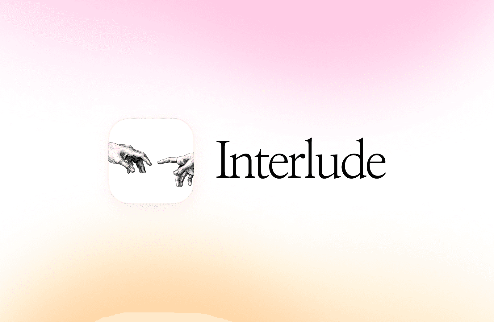
Michelangelo in an app squircle. The serif wordmark sells the seriousness
Design DNA
Type
Modern Serif
PaletteMuted warm tones
Design DNA
Turn interludeapp.net’s design into your OG
- Full color system with hex codes and harmonies
- Typography breakdown with role mapping
- Layout, patterns, and recreation steps
- One mega-prompt that has everything
Platform fit
OKFacebook / LinkedIn / Discord(1200×630)
OKX / Twitter (Large Card)(1200×628)
INFOX / Twitter (Summary)(120×120)
WARNWhatsApp / iMessage(~300×157)
OKSlack(~200×105)
OKChatGPT(~400px wide)
INFOGoogle Search(N/A)
INFOText legibility(Design tip)
interludeapp.net
Interlude
StatusRenders but may show bars or crop
SizeRecommended 1200×628, min 300×157
CropCenter-crops to 2:1. summary_large_image shows full width, summary crops to 120x120 square.
CacheX caches aggressively. New cards may take minutes to appear. Adding ?v=2 to the URL can force a refresh.
DebugCard Validator was deprecated in 2022. Post a tweet with the URL to preview, or use properOG checker.
Under the hood
og:title
Interlude
og:description
An app about presence without performance, connection without capture.
Dimensions
1600×1044
Industry
SaaS
Color mode
colorful
Layout
centered
Categories
saas
Tags
gradient
Score breakdown
+
OG Image
Has og:image tag
https://framerusercontent.com/images/N7NYsD3KSjEptUcrTJRjsY9MUBU.png
+
Image loads
og:image resolves (HTTP 200)
https://framerusercontent.com/images/N7NYsD3KSjEptUcrTJRjsY9MUBU.png
+
Dimensions
1600×1044, ratio 1.53:1 (ideal: 1.91:1). Works but 1200×630 is ideal
!
Title
Too short (9 chars). Underuses the card space
Interlude
+
Description
Ideal length (70 chars). Fills the card without truncation
An app about presence without performance, connection without capture.
+
og:type
og:type = website
!
File size
Could not determine file size
+
Twitter card
twitter:card = summary_large_image
!
Image format
PNG. Consider WebP for 30-50% smaller files
i
Title uniqueness
OG title matches page title. Consider a social-specific headline
+
Description quality
Description reads naturally
+
Favicon
Custom favicon detected
Quality Profile
AI analysis
Strengths
- +Evocative soft gradient background creates an immediate sense of calm and presence.
- +Classic artwork reference (Creation of Adam) visually supports the theme of human connection.
- +Clean, refined serif typography aligns well with the app's philosophical branding.
Improvements
- →The app icon illustration appears slightly small and offset relative to the centered group.
- →File size and format could be optimized for faster social feed rendering.
- →Lacks explicit description text on the image, relying entirely on the platform metadata.
↗
Takeaway
Pairing a soft pastel radial gradient (from warm peach to soft pink) with a stark white centered container creates instant floating depth, drawing the eye directly to the brand mark without needing harsh drop shadows.
Want your OG image this proper?
Check your current OG or generate a new one from your brand.
More like this

glideapps.comA
AI App Builder: Turn Spreadsheets into Business Apps | Glide
View editorial →
Stacked site trailers and steel framing to sell software. A literal metaphor that actually works
Stacked site trailers and steel framing to sell software. A literal metaphor that actually works

animaxxing.comA
Animaxxing
View editorial →
That tilted final X carries the whole brand. Crude, loud, impossible to miss
That tilted final X carries the whole brand. Crude, loud, impossible to miss
herokit.designA
HeroKit
View editorial →
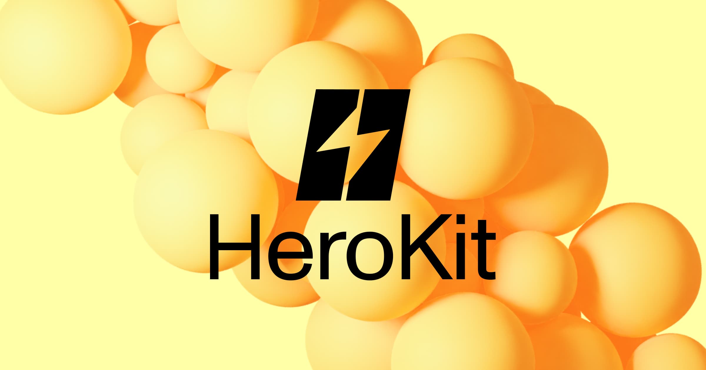
Stark black mark over soft yellow spheres. High contrast does all the heavy lifting
Stark black mark over soft yellow spheres. High contrast does all the heavy lifting
readymag.comB
Readymag
View editorial →
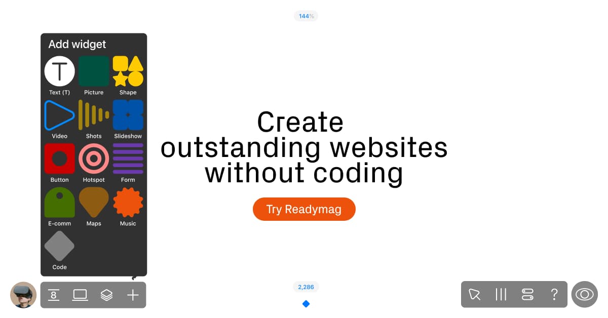
Real UI elements and thoughtful details make the product pop. The CTA could use a similar spotlight
Real UI elements and thoughtful details make the product pop. The CTA could use a similar spotlight
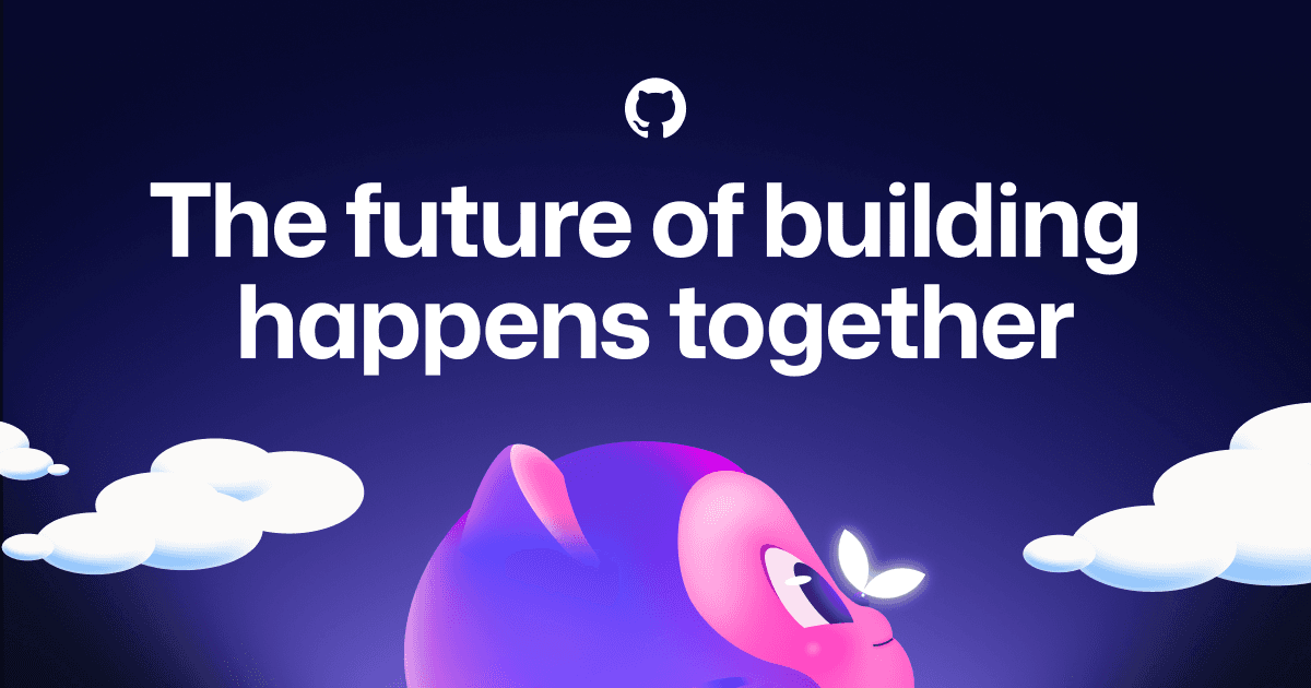
github.comA
GitHub · Change is constant. GitHub keeps you ahead.
View editorial →
A glowing butterfly on the mascot's nose. Enterprise software rendered as a bedtime story
A glowing butterfly on the mascot's nose. Enterprise software rendered as a bedtime story
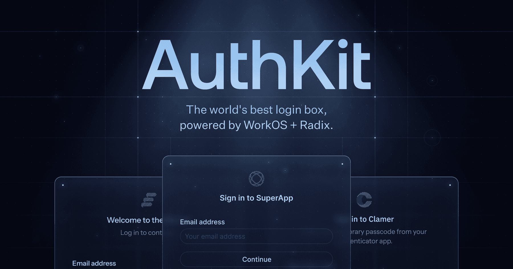
authkit.comB
AuthKit by WorkOS
View editorial →
Three login cards along the bottom. The UI doing the proof of work
Three login cards along the bottom. The UI doing the proof of work