← Check another site

8-bit-sheep.com
BOG image scorecard · 83/100 · Almost proper. A few tweaks away. · Checked
What to fix
Get it Proper in 10 minutes
5 fixes, 17 points on the table
83now 83 · all done 100
- +5Needs a new image
1200x630 is 1.91:1, the ratio every large card is cut to. Declare og:image:width and og:image:height alongside it so platforms can lay the card out before the file arrives.
Generate one that passes → - +5Quick
Under 20 characters wastes the card, over 70 truncates on X and Facebook. Write the headline for the feed, not for the tab.
- +3Quick
One sentence that says what the page gives the reader. Front-load it: everything past 160 characters is cut.
- +2Quick
Set <meta name="twitter:card" content="summary_large_image">. Without it X is free to render your 1200x630 image as a small square thumbnail.
- +2Quick
Same picture, 30 to 50 percent fewer bytes. Every platform that renders a card supports both.
Generate one that passes →
This is one page. You have others.
A good card here says nothing about the rest of 8-bit-sheep.com. The audit samples pages across its templates and finds the ones with no card, or a broken one.
Audit the whole site →Design DNA
Your brand as prompts
Complete design system extracted from 8-bit-sheep.com

Colors:
  dominant: #000000
  secondary: #FFFFFF
  accent-1: #8B4513
  Mode: dark
  Temperature: warm
  Saturation: desaturated

Recommended harmonies:
  Dark mono: bg #161212, text #eceaea, accent #2a2222
  Light mono: bg #f6f4f4, text #221c1c, accent #404040
  Complementary: bg #161313, text #F2EAE0, accent #171c1c

Typography:
  primary: Geometric Sans-Serif

Layout & visual style:
  Layout: centered
  Aspect ratio: 1.91:1 (standard OG)
  Patterns:
    Minimal
    Dark Theme
    Centered Text
    Illustration

Strengths to preserve:
  Features a unique and memorable ASCII art brand mascot.
  Clean, minimalist aesthetic with strong contrast for readability of the main brand name.
  Clearly displays essential contact information (email and phone number).

Avoid:
  The ASCII art, while unique, doesn't immediately convey 'Digital and Data Strategy Boutique'; adding a tagline or a more descriptive visual element could improve clarity.
  The contact information text is quite small and may be unreadable on smaller screens or when the image is scaled down in social media feeds.
  The overall image lacks a strong visual connection to the business's core offering, which could be enhanced to better communicate its purpose.

Pro tip: When using highly stylized or abstract branding elements like ASCII art for an Open Graph image, ensure there's a clear, complementary textual or graphical element that immediately communicates the core business offering, as context is often limited in social shares.

Recreation target:
  Format: Open Graph image, 1200x630px, PNG
  Original dimensions: 1920x1080
  Reference: https://8-bit-sheep.com/images/fb-icon-8-bit-sheep.jpg

Source: properog.com/site/8-bit-sheep.comPlatform fit
OKFacebook / LinkedIn / Discord(1200×630)
OKX / Twitter (Large Card)(1200×628)
INFOX / Twitter (Summary)(120×120)
OKWhatsApp / iMessage(~300×157)
OKSlack(~200×105)
OKChatGPT(~400px wide)
INFOGoogle Search(N/A)
INFOText legibility(Design tip)
8-bit-sheep.com
8-bit-sheep
StatusRenders but may show bars or crop
SizeRecommended 1200×628, min 300×157
CropCenter-crops to 2:1. summary_large_image shows full width, summary crops to 120x120 square.
CacheX caches aggressively. New cards may take minutes to appear. Adding ?v=2 to the URL can force a refresh.
DebugCard Validator was deprecated in 2022. Post a tweet with the URL to preview, or use properOG checker.
Under the hood
og:title
8-bit-sheep
og:description
Digital and Data Strategy Boutique
Dimensions
1920×1080
File size
76KB
Industry
Agency
Color mode
dark
Score breakdown
+
OG Image
Has og:image tag
https://8-bit-sheep.com/images/fb-icon-8-bit-sheep.jpg
+
Dimensions
1920×1080, ratio 1.78:1 (ideal: 1.91:1). Works but 1200×630 is ideal
!
Title
Too short (11 chars). Underuses the card space
8-bit-sheep
!
Description
Too short (34 chars) for rich previews
Digital and Data Strategy Boutique
+
og:type
og:type = article
+
File size
76KB. Well optimized
!
Twitter card
No twitter:card tag. Will fall back to og:image
!
Image format
JPEG. Consider WebP for better compression
i
Title uniqueness
OG title matches page title. Consider a social-specific headline
+
Description quality
Description reads naturally
i
Favicon
ICO favicon. Works but SVG is crisper in modern browsers
Quality Profile
AI analysis
Strengths
- +Features a unique and memorable ASCII art brand mascot.
- +Clean, minimalist aesthetic with strong contrast for readability of the main brand name.
- +Clearly displays essential contact information (email and phone number).
Improvements
- →The ASCII art, while unique, doesn't immediately convey 'Digital and Data Strategy Boutique'; adding a tagline or a more descriptive visual element could improve clarity.
- →The contact information text is quite small and may be unreadable on smaller screens or when the image is scaled down in social media feeds.
- →The overall image lacks a strong visual connection to the business's core offering, which could be enhanced to better communicate its purpose.
↗
Takeaway
When using highly stylized or abstract branding elements like ASCII art for an Open Graph image, ensure there's a clear, complementary textual or graphical element that immediately communicates the core business offering, as context is often limited in social shares.
What proper looks like in Agency
planetono.spaceA
Planetoño
View editorial →
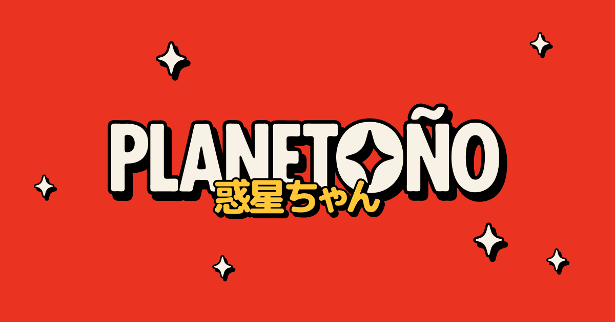
A four-point star knocked out of the O. Heavy black drop shadows on pure red
A four-point star knocked out of the O. Heavy black drop shadows on pure red
humaninterest.co.nzB
Human Interest - Copywriting, Feature Writing, Editing & Communications
View editorial →
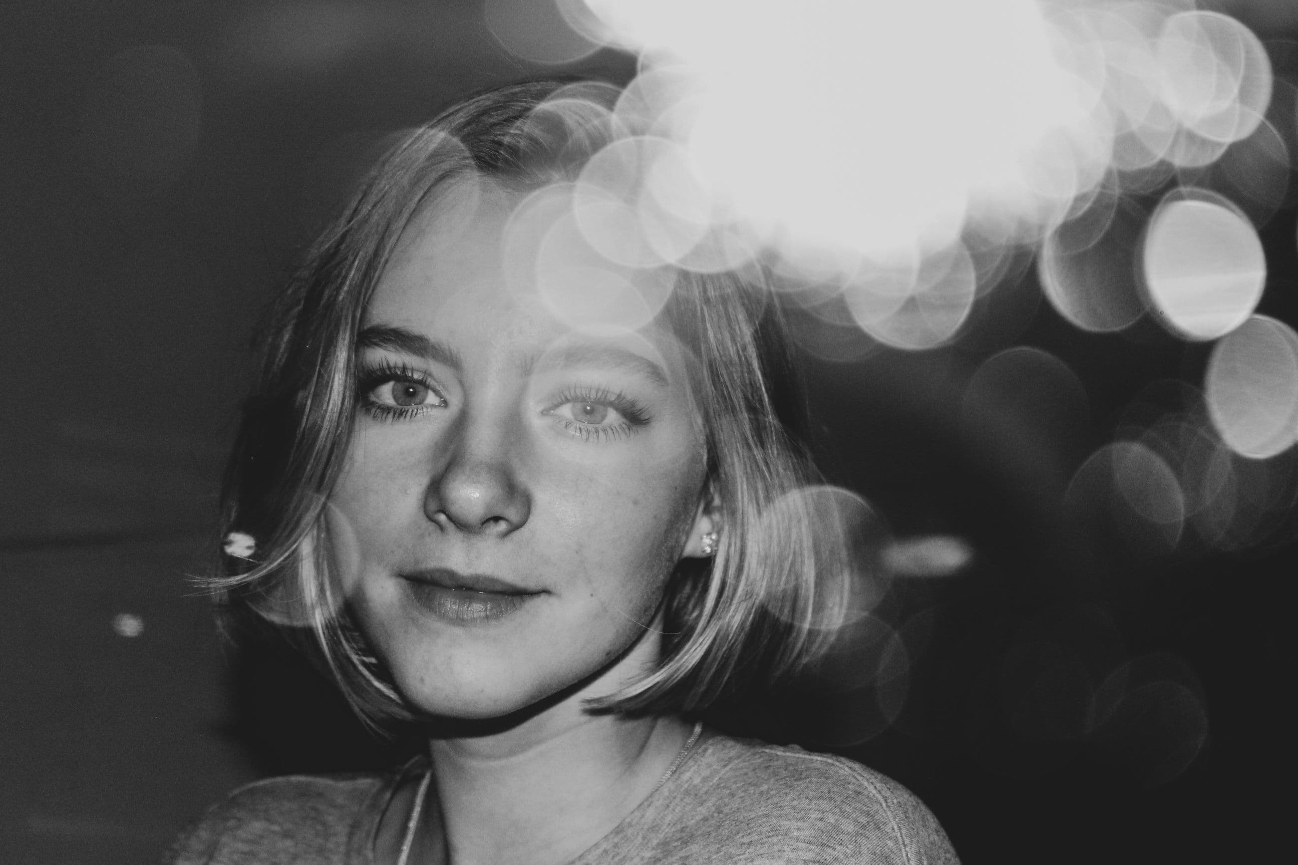
Zero copy for a writing agency. Just a monochrome portrait drowning in bokeh
Zero copy for a writing agency. Just a monochrome portrait drowning in bokeh
springsummer.dkB
Spring/Summer | Copenhagen based digital first Design & Brand Agency
View editorial →
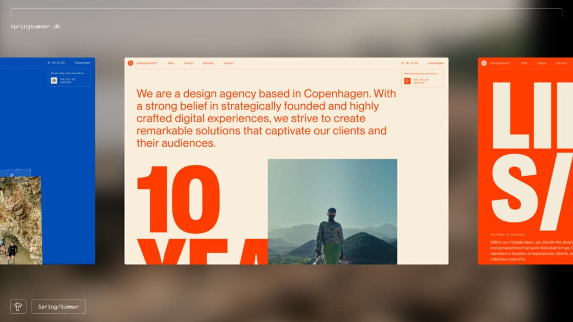
Three browser viewports side by side. The giant orange type does all the heavy lifting
Three browser viewports side by side. The giant orange type does all the heavy lifting
damngoodbrands.comA
Damn Good Brands | (Ad)venture™ Fund
View editorial →
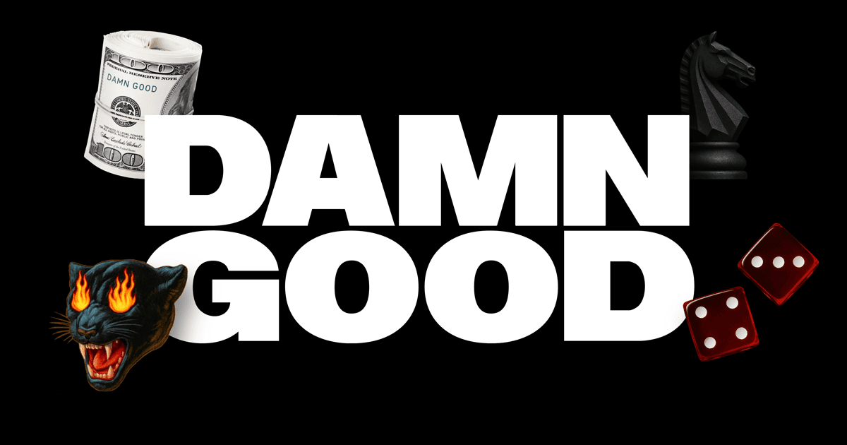
Rolled cash, red dice, flaming panther. Today's hype aesthetic anchored by heavy white type
Rolled cash, red dice, flaming panther. Today's hype aesthetic anchored by heavy white type
Check another site
Free. No signup. Paste any URL.
More like this
planetono.spaceA
Planetoño
View editorial →
A four-point star knocked out of the O. Heavy black drop shadows on pure red
A four-point star knocked out of the O. Heavy black drop shadows on pure red
humaninterest.co.nzB
Human Interest - Copywriting, Feature Writing, Editing & Communications
View editorial →
Zero copy for a writing agency. Just a monochrome portrait drowning in bokeh
Zero copy for a writing agency. Just a monochrome portrait drowning in bokeh
springsummer.dkB
Spring/Summer | Copenhagen based digital first Design & Brand Agency
View editorial →
Three browser viewports side by side. The giant orange type does all the heavy lifting
Three browser viewports side by side. The giant orange type does all the heavy lifting
damngoodbrands.comA
Damn Good Brands | (Ad)venture™ Fund
View editorial →
Rolled cash, red dice, flaming panther. Today's hype aesthetic anchored by heavy white type
Rolled cash, red dice, flaming panther. Today's hype aesthetic anchored by heavy white type
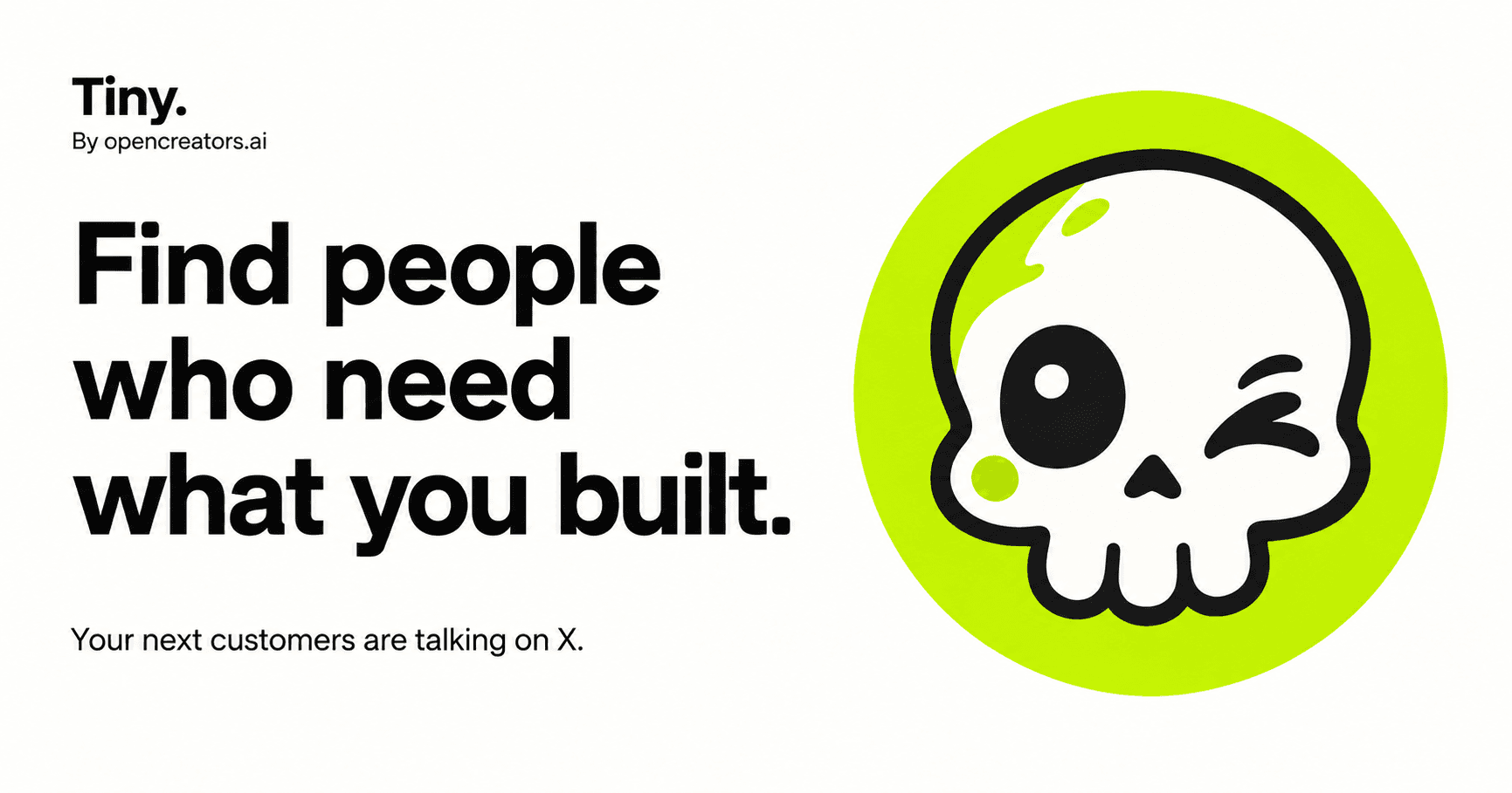
tiny.opencreators.aiA
Someone is asking for what you built.
View editorial →
Winking skull on an acid yellow disc. Early Snapchat mascot energy doing all the heavy lifting
Winking skull on an acid yellow disc. Early Snapchat mascot energy doing all the heavy lifting
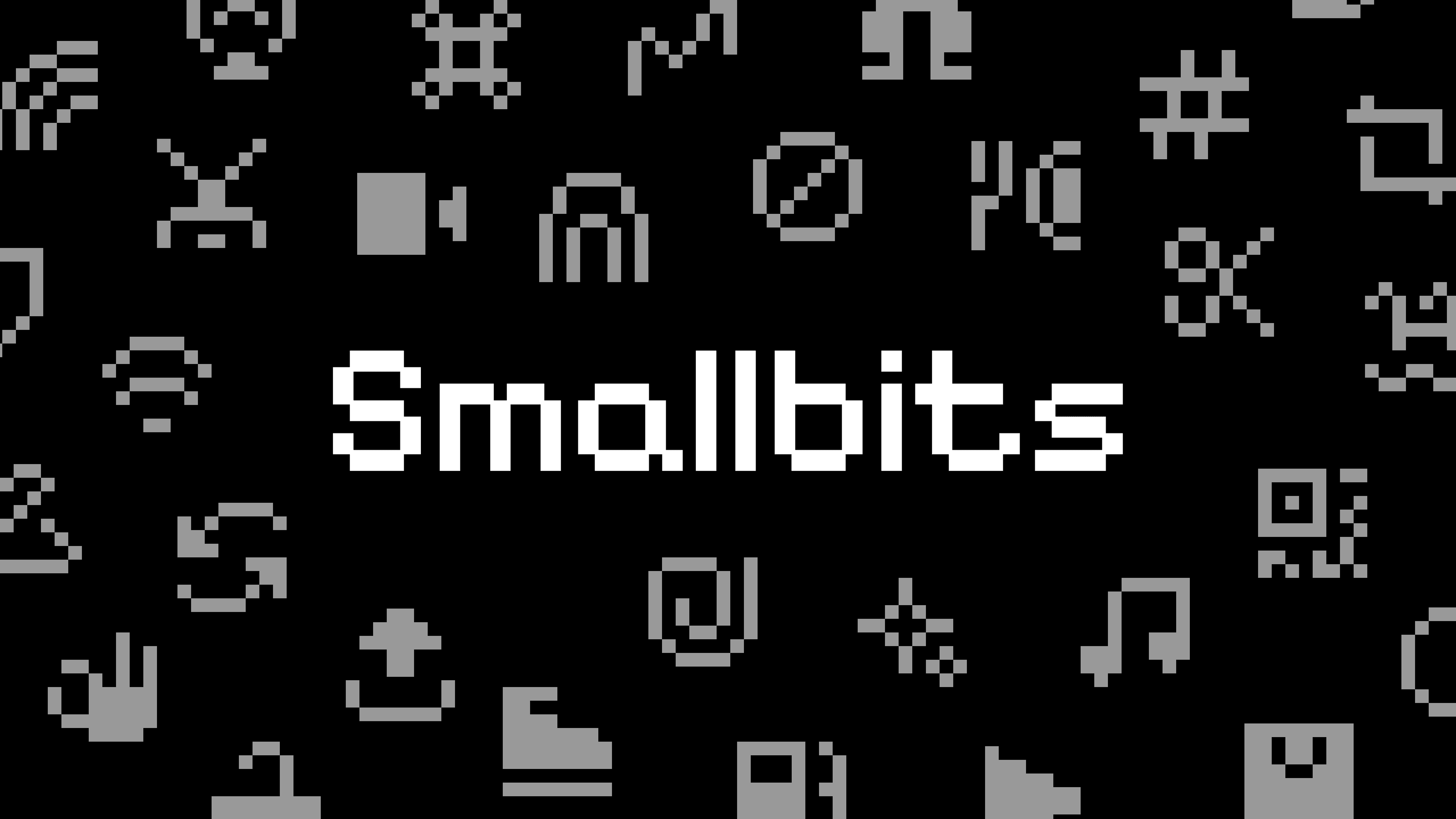
smallbits.designA
Smallbits – 290+ pixelated icons on an 8×8 grid
View editorial →
Scattered 8x8 pixel icons on black. Retro nostalgia works when the grid is this strict
Scattered 8x8 pixel icons on black. Retro nostalgia works when the grid is this strict